Another 100 push-ups for hitting 200 upvotes on our Product Hunt launch! 🚀🚀🚀 We'll hit 1000 push-ups if it means product of the day! 💪 If you want to see our team suffer more, please upvote our launch here: producthunt.com
Helicone's Rebrand Story
Founding Product Designer. Rebranded Helicone, a YC-backed seed-stage startup into an enterprise-ready platform.
Brand IdentityGTM StrategyInteraction DesignVisual Design

About Helicone
Helicone (YC W23) is the all-in-one LLM observability platform that helps enterprise teams monitor, debug, and optimize their AI applications. I joined as a founding designer (first hire) in March 2024 to help Helicone stand out and acquire enterprise customers among the surge of AI devtools.
Role & Timeline
Founding growth designer, March 2024 - Present
Contributions
Branding, GTM strategy, marketing & content
Team
Cole Gottdank (CTO), Justin Torre (CEO), Kavin Desi Valli (Software Engineer)
Impact
Within 2 months, the rebrand led to doubling of user base and landing enterprise customers like Sony, Robinhood, Roblox, Duolingo, and Singapore Airlines.

Before we go on...
Lots of process and research, guides the Helicone rebrand — the rest of the case study covers wonderful research, creative problem solving, and architectural redesigns. But if you're in a time crunch, feel free to:
Challenge
How might we communicate enterprise readiness?
At the time, we had over 7,000 users who loved Helicone. Our observability features spoke to enterprises who were starting to build with LLMs. Our brand, however, didn't communicate enterprise readiness. I led a holistic rebrand that targeted visual design, awareness building, and increasing engagement, to bridge the enterprise adoption gap.
Landing page revamp
Finding the precise language that resonates with technical decision-makers and addresses concerns about enterprise readiness.
Guerrilla marketing, social media strategy, newsletter
Keeping a heartbeat with the developer community and unconventional, low-cost marketing tactics to get attention & exposure.
Product & rebrand launch
Activating our community while introducing the new Helicone to a broader audience.
Research & Discovery
How might we position ourselves?

"Enterprises need LLM observability but had concerns with compliance, security, reliability and complexity of integration."
As a startup, it was of utmost importance to highlight a few differentiators that aligned with the enterprise customers we want to acquire, and do it well. We needed to project confidence, reliability, and ease of integration.
Customer-Obsessed
Transparent pricing, fast and responsive customer support.
Open-Source & Developer-First
Easy integration, simple onboarding and concise, straight to the point docs.
Reliable with 99.99% Uptime
Exude enterprise qualities like compliance, security, and reliability.
Logos Explorations
We explored metaphors: are we a lightweight toolbox? Building blocks for LLM? A crystal ball, or a window to get clarity on how users are interacting with your LLM app?


The Final Logo
The final logo is a dynamic 3D cube, capturing clarity, transparency and playfulness. As we grow to solve problems across data collection, monitoring, and instrumentation, the cube reflects our multi-dimensional approach: light-weight, transparent, and a little bit of fun.
![]()

Branding Assets
Our customers say that the new logo resembles an ice cube. We leaned into it - our bouncing cube now shows up in our newsletter, marketing and campaigns with some personality.

"Just gotta say, I'm really happy with how our branding and marketing is coming together. I like the playful/chill approach and think it fits really well with what we're doing, really reflects how we operate as well."
Scott Nguyen, Cofounder of Helicone
Landing Page, Designed for Enterprise
Competitive Landscape
The research started with an in-depth analysis of the competitive landscape to answer the question: what makes Helicone different?

Helicone is designed for the fastest time-to-value and easiest to get started with. While other platforms may require days to integrate, Helicone can be implemented in minutes with one line change to your base URL.
Teams choose Helicone when they need comprehensive observability with minimal engineering investment and want features that directly impact the bottom line, like built-in caching that reduces API costs by 20-30%. We wrote a detailed blog post about it here.
Design Direction
Inspired by developer-first tools like Vercel, Linear, Supabase, we sought something more visceral and bold. An interactive experience that lets users feel the product, not just read about it. An experience that breaks free from safe, cookie-cutter templates.
Elevating Enterprise Perception
Signal enterprise readiness without alienating the technical audience that formed Helicone's foundation, striking that delicate balance between approachability and authority.
Highlighting Ease of Integration
With an understanding that developers judge the usefulness of a product by ease of integration, we decided to meet them where they're at.

Creating Visual Differentiation
Our visuals comes with a deliberate shift toward deeper, more confident tones, yet still playful.
We emphasized the product's capabilities with interactive elements, and rejected the homogeneous design patterns common among AI startups in favor of asymmetry.
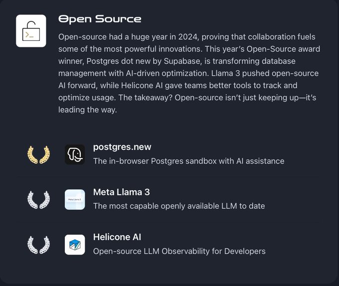
Product Hunt Launch
We launched the rebrand through Product Hunt, activating our community while introducing the new Helicone to a broader audience. I led the campaign, which helped us secure #1 Product of the Day and #3 product of the year in the open-source category, just trailing Meta's LLaMA.

Key Learnings
Balance technical and business messaging.
Enterprise decision-makers need proof of technical usefulness and business value. It's crucial to find the precise language that resonates with both technical and non-technical decision-makers while addressing organizational concerns.
Community as brand advocates.
Our existing developer community became our strongest brand ambassadors when we included them in the rebrand process. Their support drove significant organic growth and traffic during our rebrand launch.
Measure everything, but prioritize clarity.
While we tracked extensive metrics, focusing our communication on a few key impact measures created much clearer narratives for both internal and external stakeholders.
Behind the scenes...
Seeing @helicone_ai as top 3 Open-Source product of the year for @ProductHunt is insane to me, and an absolute dream come true! Thank you everyone that supported us throughout our journey and huge shoutout to @rajivayyangar and your team for putting this together 🙏
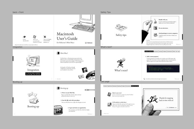
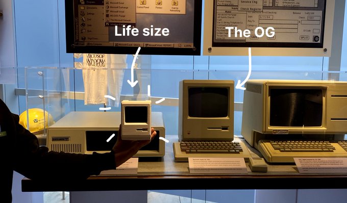
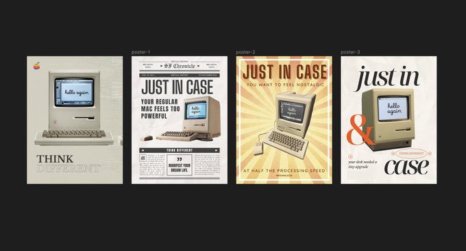
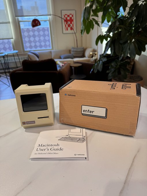
we built a working Macintosh from scratch! - 3d-printed case (with the og color) - a fully functional 480x640 raspberry pi - boots up in the style of the original Mac UI - custom packaging & manual let's build more things just for fun in 2025
This is the coolest PR box I’ve seen. Huge thanks to the @helicone_ai team for the awesome swag
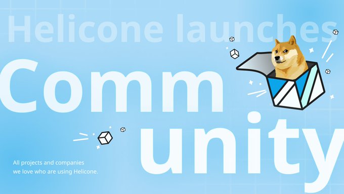
🎉 We are excited to launch Helicone Community!🎉 🌟This month, we're spotlighting these outstanding projects and companies (in no particular order) built by developers like you. Thank you for being a part of our journey, and we're excited to keep growing with you! (🧵)
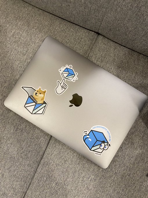
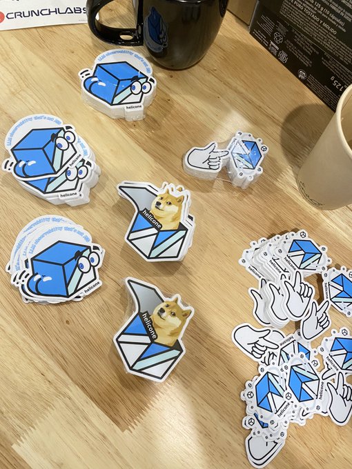
Working at a startup is being able to make stickers like this